

Four systems, one patient.
Designing a user-centric telemedicine app connecting insurance providers, healthcare providers, pharmacies and patients, improving the end-to-end healthcare experience.


Our goal was to put appointments, prescriptions, pricing and the consultation in one place, so that coordinating care stopped being the patient's job.
Four parties, no shared view.
The American healthcare system is made up of doctors, patients, insurance providers and pharmacies, and every one of them has needs the other three cannot see.
How might we improve communication between distinct healthcare stakeholders, enhancing the overall healthcare experience?
Patients
Want one place to raise an urgent or minor concern, order and refill a prescription, and make, reschedule or cancel an appointment.
Doctors
Want the same digital route to a patient for urgent or minor concerns, and need to hear from a pharmacy when a medication is out of stock.
Pharmacies
Hold the medication inventory a patient cannot see, and need anything touching it to be secure and HIPAA-compliant.
Insurance providers
Hold the in-network pricing for prescriptions and appointments that patients want to see in real time.
Needs as the research recorded them, across 15 healthcare consumers, 8 medical workers and 1 insurance provider.
Draw, test, draw again.
Desk research and twenty-four conversations came before the first wireframe, and the home screen was drawn four more times after it. What follows is the order it actually happened in.
01Discover
Desk research first, then twenty-four conversations.
Secondary research came before anyone was interviewed, to establish the present adoption of telemedicine, the healthcare use cases it covers, and which solutions already on the market best facilitate telemedicine features. Knowing what exists is what keeps an interview from re-discovering it.
Interviews then ran across every party in the system: 15 healthcare consumers, 8 medical workers (2 licensed physician assistants, 3 medical doctors and 3 pharmacists) and 1 insurance provider. Participants were drawn from diverse backgrounds so the sample was not a single kind of patient describing a single kind of visit.
Strengths
What the product would already have going for it, before a single screen was built.
- Novel enough to be a reason to try itTelemedicine was still new enough that the technology itself was a draw rather than a box to tick. It is a strength with a shelf life: it stops being one the moment the category matures.
- The only one a competitor cannot buyEvery other strength here is something the product would have. This is the one about how it would be made, which is also why it cannot be acquired by signing a contract.
- Breadth is the strength, not any one serviceAppointments, prescriptions, pricing and the consultation in one place. Each of those already exists somewhere else; having them together is what none of the alternatives offered.
- The same item as an opportunity oppositeProvider relationships are what make this a place care happens rather than a place care is described. The ones already held are the strength; the ones still available are listed under Opportunities.
- Integrations appear three times on this gridHere as a strength, opposite as API integrations, and below as partner integrations. Real-time in-network pricing is the most valuable thing the product could offer and the thing it least controls.
- Written into two quadrants by nameA strength here and a weakness directly opposite, which is the honest way to record it. Handling health data well is a reason to be trusted, and an obligation that has to be met before launch rather than after it.
Weaknesses
What it would lack, or would have to build first before anything else could work.
- Nobody is looking for it yetA new name in a category where the incumbents are insurers, hospital systems and pharmacy chains. That is a distribution problem before it is a design problem, and design cannot solve it alone.
- It cannot start smallIntegrations, compliance and clinical staffing all cost before the first patient arrives. A telemedicine app with one pharmacy partner and one insurer is not a smaller version of the product, it is an unusable one.
- Regulation appears three times on this gridHere, beside it as regulatory compliance, and opposite as regulatory challenges. HIPAA is the version that has to be satisfied before anything ships, which is what makes it a weakness rather than a threat.
- The wider version of the line aboveLicensing, prescribing rules and state boundaries, each of which can differ from the last. It sits on this side rather than under Threats because it is work the product has to do, not a condition it has to survive.
- Integrations again, this time as the buildThe same theme as insurance partner integrations opposite and partner integrations below. Every partner is a different API on a different timetable, and none of them are yours.
- The other half of the pair oppositeThe same words in the Strengths quadrant, on purpose. Security is an asset the day it is finished and a liability every day before that, and a SWOT that records only one of those is not telling the truth.
Opportunities
Conditions in the market moving in its favour, whatever the product turned out to be.
- The condition the whole product bets onIt is an opportunity rather than a strength because it belongs to the market, not to this product. It lifts every telemedicine app at once, including the ones that have not been built yet.
- Worth most exactly where care is hardest to getPlaces where the nearest provider is far enough away that distance itself is the barrier. Remote consultation is most valuable precisely where in-person care is least available, which is not true of most software.
- A habit that exists before the product doesPeople already tracking and managing their own health arrive willing to use an app for it. The opportunity is that the behaviour does not have to be taught, only met.
- The outward face of a strengthThe healthcare partnerships listed on the strengths side, read from the other direction: what is already signed is the asset, what is still available is the growth. One item, two quadrants.
- Read this one next to the regulation itemsEvery border crossed multiplies the compliance work sitting in the weakness column. That is why it belongs here as a possibility rather than anywhere as a plan.
- From booking care to noticing it is neededContinuous data from a device the patient already owns would change what the app is for. It is an opportunity because the devices exist and the connection does not.
Threats
Conditions in the market that could undercut it, whatever the product turned out to be.
- The third appearance of regulationThe version nobody controls: rules that change after the product is built, in places it has already launched. Compliance is work you can schedule; this is not.
- The threat side of data securityThe same theme that is a strength and a weakness elsewhere on this grid. A breach in health data is not a bad quarter, it is the end of the trust the whole product runs on.
- The one threat design can actually answerPatients who do not believe a consultation without a room is real care, and providers who do not want another system to sign into. Both are reasons the interface had to earn trust rather than assume it.
- Ageing faster than the partnerships matureWhatever this is built on will need replacing before the integration work is finished. It is a threat because it costs real effort and produces nothing a patient can see.
- Integrations for the third time, and the sharpestA partner can change an API, raise a price or sign with somebody else. When that happens the feature that depended on them stops working, and none of it was your decision.
- The growing telehealth trend, laterThe same condition listed as an opportunity in the quadrant diagonally opposite. Everything that makes the category attractive is also what makes it crowded, and the two are the same fact at different times.
02Define
Every note on one wall, then three people to design for.
Interview insights were organised using affinity mapping, which is the step that turns a pile of individual complaints into the small number of problems actually worth solving. Personas were then developed from interviewee demographics and responses rather than from assumption.
The sort settled on three primary user groups impacted by telemedicine applications: patients, doctors and pharmacists. Four parties were interviewed and only three became personas, because the insurer turned out to be a source of information the other three needed rather than a daily user of the product.


02Define
Six features, and nothing else.
Synthesis produced six primary features, all of them aimed at the same thing: consolidating and simplifying healthcare processes and systems that are traditionally confusing and disconnected. Six is the number the research produced, and holding the scope to it is what kept the rest of the work finishable.
Telemedicine
Patients and doctors want a digital solution to discuss urgent or minor health concerns.
Prescription management
Consumers want a mobile solution to order and refill prescriptions.
Appointment management
Consumers want a mobile solution to make, reschedule and cancel medical appointments.
Insurance partnerships
Consumers want to view in-network pricing for prescriptions and appointments in real time.
Pharmacy partnerships
Consumers want to view medication inventory at selected pharmacies, with stock outages communicated to their physician.
Data storage and security
Doctors and pharmacists need the app to be secure and HIPAA-compliant.
Ten candidate features were then scored against each other on two axes: customer importance and business impact. The five that scored high on both are the ones that became the MVP.
- Highest on both axesThe research asked for real-time in-network pricing on prescriptions and appointments, and none of that exists without the insurer. The SWOT has insurance integrations on the strengths side and the risk side at the same time.
- The premise, not the differentiatorPatients and doctors both asked for a way to discuss urgent or minor concerns without a visit. It sits lower on business impact than the three integrations because it is a capability the product builds itself rather than a relationship it opens.
- A strength and an opportunity at onceThe SWOT lists healthcare partnerships as an internal strength and provider partnerships as an external opportunity, which is unusual for one item. Nothing in the app resolves until a provider is on the other end of it.
- The consultation itselfHigh customer importance, lower business impact on its own, because it is what the telehealth capability is for rather than a separate line of value beside it.
- A loop, not a lookupThe research asked to see medication inventory at selected pharmacies and to have stock outages communicated back to the physician. That round trip needs the pharmacy on the other end, which is what lifts it on business impact.
- Wanted, and not blockingPatients wanted it and the app needs somewhere to hold history. It scores low on business impact because it depends on no outside party and unlocks nothing else, so it can arrive after the integrations without holding them up.
- Of its momentGenuinely wanted at the time this was scored. It sits low on business impact because it is beside the care loop rather than inside it: nothing else in the app needs it to work.
- Asked for by the business, not the researchReviews are a reason to come back to a directory, which is why they score at all on business impact. They are not among the six features the research produced, which is why they score low on the other axis.
- A layer on a feature that did not exist yetAppointment management came out of the research; reminders did not. A notification on top of scheduling only earns its place once the scheduling is there, which is why it scores low on both.
- A refinement, not a reasonThe same story as reminders. A richer view of a scheduling feature that had to exist first, so it scores low on both axes rather than competing with the five above it.
03Develop
Route before screen.
The platform decision came first and was not a preference. A Pew Research study shows an increasing share of health consumers using mobile apps over desktop to connect with providers and manage health data, so the work was scoped to a mobile application before a single flow was drawn.
Feature prioritisation and user story development came next, and only then were user workflows defined through flow mapping. Drawing the route first is what stops a redesign from becoming a set of screens that each work and do not join up.
Interfaces were then sketched rapidly, on paper and in Balsamiq. Those rapid prototypes guided the wireframes in Figma, low fidelity first and then mid fidelity: multiple variations explored, and the most promising elements of each merged rather than one draft being defended.


03Develop
Designed against the fear of hospitals.
Nosocomephobia, the fear of hospital environments, is driven in part by the colour associations people hold with sterile clinical spaces. The palette was therefore built from a mix of whimsicality, tranquility, and urgency where urgency was needed, rather than from the institutional blues and whites the subject would normally attract.
Design research also indicates a positive correlation between user trust in medical settings and a non-institutional, playful design aesthetic. That finding is what put illustration into the interface: the playfulness had to be made tangible somewhere, and illustration is where it could carry meaning rather than only decorate.

04Deliver
Three tasks, then four passes at the same screen.
The first wireframes put a home screen around the six features, prioritised by user need, with navigation to the patient dashboard, appointment management and the user profile. Then they were handed to participants with three tasks, because a home screen that looks organised and a home screen somebody can finish a job in are different claims.
The sessions surfaced two needs the six features had not covered: a dedicated button for prescription maintenance, and search across the whole app. Both went into the next pass. Everything after this point is the same screen, redrawn.

Structure only. Six features, prioritised by need. Nothing yet decided about how it would look.

The two things testing asked for: a prescription maintenance button, and search across the app.

Visual weight enters the calls to action and the fields, marking the real interaction points.

Illustration arrives, pulling attention to the zones, buttons and fields a workflow needs.

The remaining feedback incorporated and the visual elements polished.
Four parties, one place they meet.
Each screen below puts the patient in the same place as one other party: the doctor for the consultation, the insurer for the price, the pharmacy for the refill. A fifth makes sure the consultation can be read as well as heard.
A way in, before anything else.
Registration and log in, for new and returning patients, ahead of every other feature in the app. It is the least glamorous screen in the set and the one every other screen depends on.

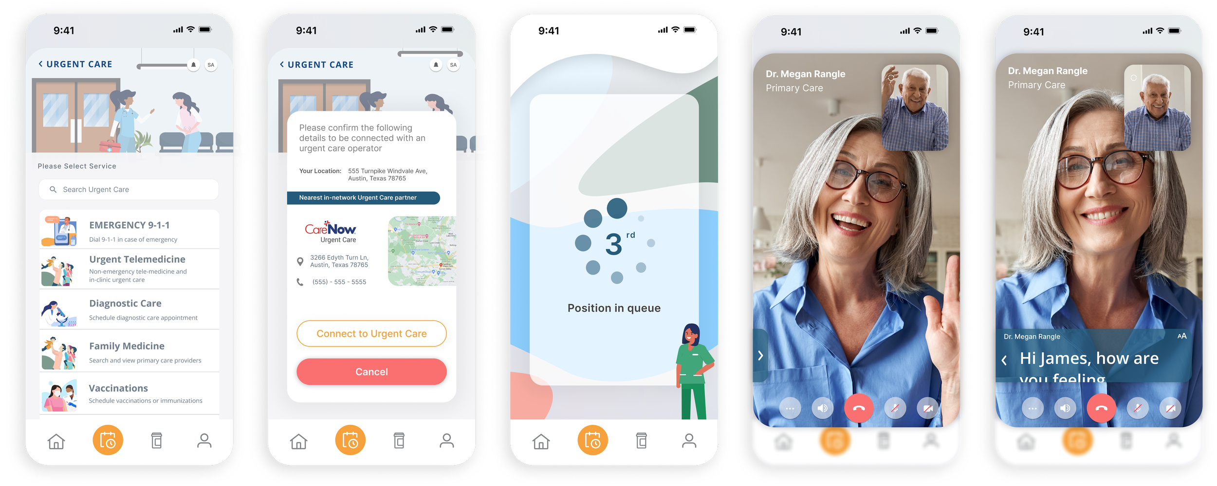
The consultation, without the room.
Video telemedicine that empowers patients and healthcare providers to connect seamlessly and securely, offering convenient, real-time consultations, diagnostics and medical advice.
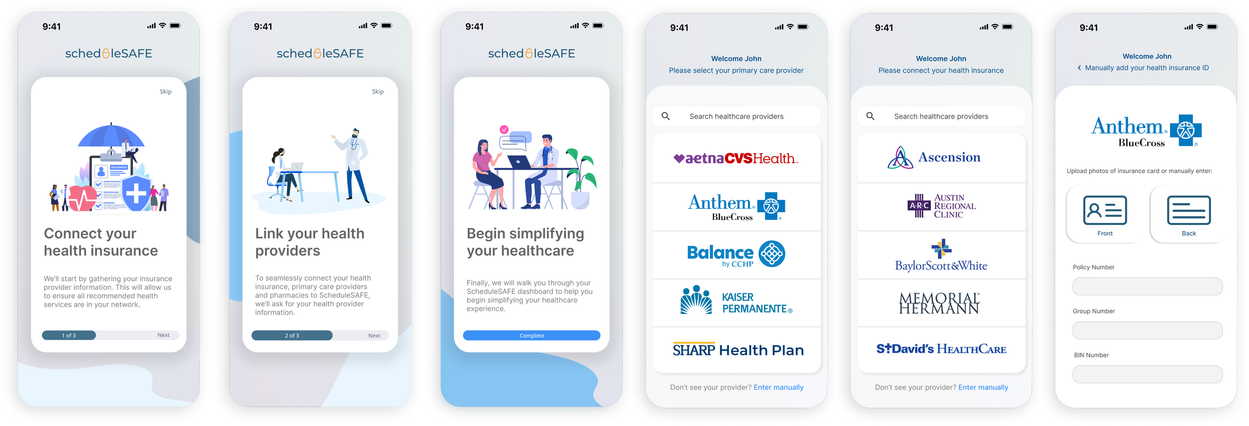
The price, before the decision.
Connecting health and insurance providers so patients can access transparent, real-time pricing information for medical services and prescriptions, making informed and cost-effective decisions about their own care.
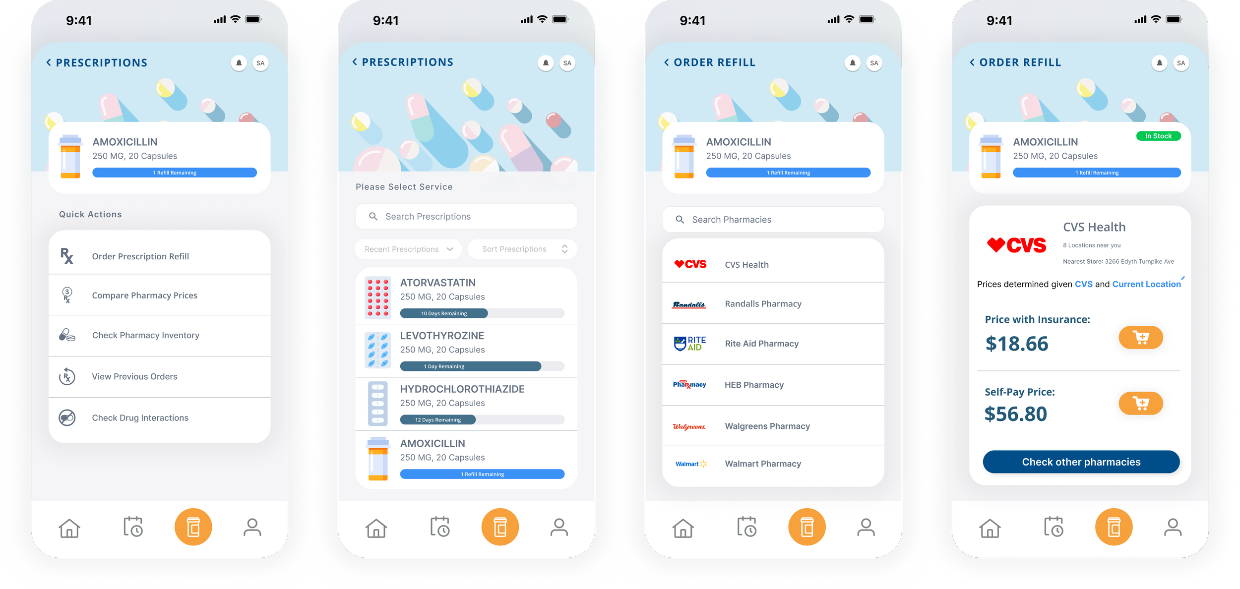
The refill, without the phone call.
Prescription maintenance that lets patients order, reorder and check pharmacy medication inventory directly from their phone, rather than finding out a medication is out of stock on arrival.
A consultation you can read.
Robust closed captioning provides real-time, accurate transcriptions of medical consultations, making healthcare information accessible to people with hearing impairments. A telemedicine call that cannot be heard is not a consultation, it is a missed appointment.


One place for care, and one less job for the patient.
One application holding appointments, prescriptions, in-network pricing and the consultation itself, so the work of coordinating care sits with the product rather than with the person receiving it.
Six needs, one application.
The six the research produced (telemedicine, prescription management, appointment management, insurance partnerships, pharmacy partnerships and HIPAA-compliant storage) arrived in one place, rather than spread across the four parties a patient had been holding together themselves.
Tested, then drawn again.
Three tasks put in front of participants surfaced two needs the six features had not covered: a dedicated button for prescription maintenance, and search across the whole app. Both went into the next pass, and the home screen was redrawn five times rather than defended once.
Accessible by default.
Robust closed captioning provides real-time, accurate transcriptions of medical consultations, designed as part of the product rather than retrofitted once somebody raised accessibility concerns.