
Reimagining employee experience.
Designing and deploying a consolidated enterprise HRIS for a global strategy consulting firm, driving employee satisfaction through transparency in metrics and career growth.

Our goal was to make every metric, opportunity and career path visible in real time, so that growing here no longer meant leaving here.
People-first, tooling last.


A global strategy consulting firm whose proposition rests on a people-centric approach to talent management. Paradoxically, the work of managing a career happened everywhere except in one place.
How might we consolidate and redesign disconnected enterprise platforms to improve the overall employee experience and reduce attrition?
“I want to know the information I’m putting in is being fed somewhere. It’s a vacuum. I don’t see it happening so I lose trust in the tool.”
“I don’t feel like I need a magical dashboard, but some of these tools don’t talk. This is so archaic.”
“It is a laborious process to get a role approved.”
“Gives directions on how to transition my career, which could be clearer, but useful nonetheless.”
“People are going to leave the company because of this platform. I’m having to spend 40 hours filling out these questions.”
Verbatim, from thirty interviews across title and tenure.
Ask first. Draw second.
Thirty interviews and a fifty-person survey came before a single wireframe. What follows is the order it actually happened in.
Thirty people, thirty minutes each.
Live interviews with thirty people of differing title and tenure, structured in two halves. The first fifteen minutes were contextual inquiry, watching somebody use the platform they already had, rather than asking them to describe it. The second fifteen were a conversation about what they had been trying to do when it got in the way.
A self-guided survey went to fifty more for the quantitative side, so the themes that came out of the interviews could be checked against a population rather than a room.
The number of questions you have to fill out is insane.
It feels like rewriting your resume, but for [the company].
It feels like an individual experience that we’re all doing because we have to.
Every note on one wall, sorted until it stopped moving.
Interview notes and open-text survey answers went up on a wall in Miro as individual observations, with no categories decided in advance. They were then grouped by affinity, regrouped, and regrouped again until the groupings stopped changing, which is the only signal that the themes came out of the evidence rather than out of the person moving the notes.
Each note was also tagged as a pain point or as something people valued, so a cluster could be read two ways at once: how often it came up, and whether it came up as a complaint. Several of the busiest clusters turned out to be both.
The wall settled into twenty clusters, from role mastery and the career framework through to certifications, knowledge management and the cost of switching between tools. All twenty are in the table below.
Six of them carried enough weight to become the platform's brief, six features to reimagine, all of them circling the same two things: transparent performance management, and career growth you can see the steps of.
Actionable metrics
Utilisation metrics displayed in real time, alongside recommendations for improving them.
Talent networks
The ability to search other practitioners and network globally by capability, not just by name.
Learning opportunities
Actually-useful learning and career-growth content served to people rather than searched for.
Workforce management
Being recommended the client staffing opportunities that are relevant to you.
Team performance management
Not only your own metrics, but holistic regional and global ones alongside them.
Career growth pathways
Clearly outlined steps to reach a defined outcome, without having to change employers to do it.
- Source
- Thirty interviews and a fifty-person survey
- Method
- Affinity grouping, re-sorted until the groupings stopped changing
- Output
- Twenty clusters, and the six features they came down to
| Cluster | What it covered |
|---|---|
| Role mastery, levels | How proficiency is defined, and how long it takes to move |
| Role mastery, approval | Who signs a role off, and how long that takes |
| Role descriptions | Whether the written roles matched the work people do |
| Career framework | The route between the stage you are at and the one you want |
| Career navigator | The tool for planning that route |
| Landing page and dashboard | What belongs on the first screen of the day |
| Current use | What people actually open the platform to do |
| Profile and internal resume | The record of what someone has worked on |
| Staffing opportunities | Finding open roles, and filtering them |
| Staffing input | Declaring availability and preference |
| Certifications | What is held, what expires, what it qualifies you for |
| Knowledge management | Finding the person who has already solved it |
| Connections to other systems | Where the platform has to talk to something else |
| Context switching | The cost of doing one task across several tools |
| Pricing tool | Building a price and a margin |
| Forecasting tool | Projecting a project before it starts |
| Overall platform processes | The rules and routines wrapped around the product |
| UI enhancements | Specific interface complaints and requests |
| AI opportunities | Where people wanted the system to suggest rather than ask |
| Future use cases | What people would reach for it to do next |
Scroll the map sideways to read it.
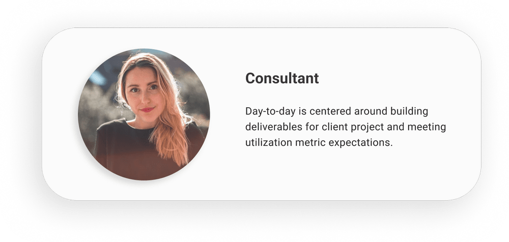
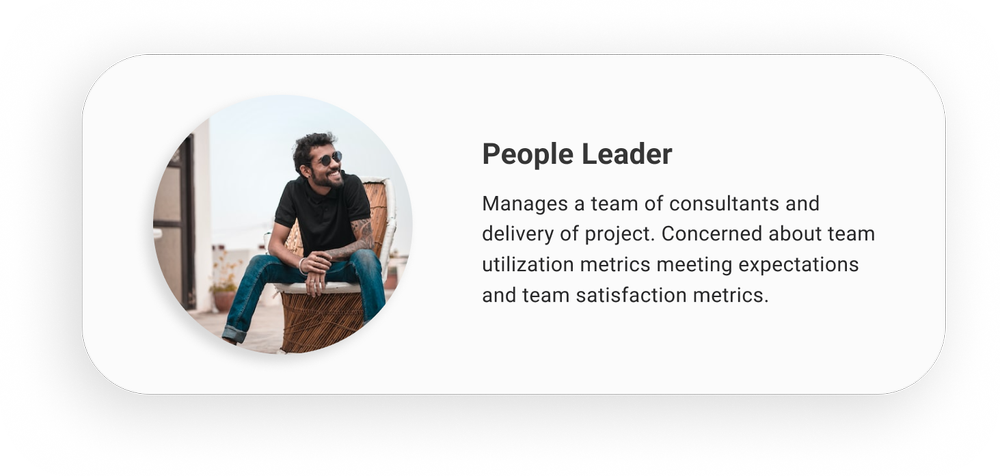
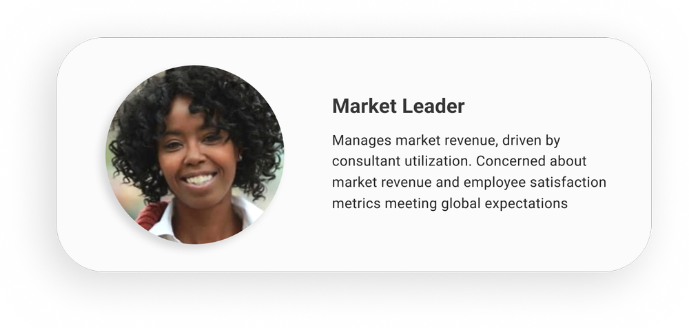
Three people to design for.
The same sort produced three archetypes, a consultant, a people leader and a market leader, who each meet the same platform at a different altitude and want opposite things from it. The consultant is trying to get a job done and be seen doing it; the people leader is trying to see a team without asking them; the market leader is trying to see a business.
They came out of the wall rather than being drawn first and confirmed afterwards, which is the difference between an archetype and a stock photograph with a name on it.
The flow as it was, then the flow as it should be.
We mapped the existing user flows first, every route through the old platform, drawn end to end, from the dashboard out to profile, roles, time, opportunities, the role library and learning. Laid out together they were the argument: reaching one job-critical number meant a different disconnected sequence for every feature.
Doing it in that order is the whole point. Draw the future state first and a redesign quietly reproduces the thing it was meant to replace, because the old shape is the only shape anybody in the room can picture.
Card sorting then drove the future-state information architecture, the reorganisation came from how people group these tasks themselves rather than from how the old navigation happened to be built. The proposed flows went back to users and were refined against their feedback before anything was drawn at fidelity. Several variations followed, and the most promising parts of each merged into low-fidelity wireframes.

Modular by default, argued over weekly.
The platform already ran on a custom design system, so the wireframes kept it and the later prototypes extended it rather than starting a second one. Building from existing components is what keeps a redesign from becoming the next piece of technical debt.
Review sessions ran weekly with product owners and solution architects. Their feedback was a standing reminder of real technical and financial constraints, and it shaped the design as it was being made instead of arriving after it was finished.

Built for everyone, then measured.
High-fidelity prototypes came only once the structure had been validated in wireframes, so the last decisions left were what goes inside the fields rather than where the fields go. A dark mode and a high-contrast variant were built alongside the default, not retrofitted onto it once someone raised accessibility as a concern.
As features deployed, we watched bounce rate, pages per visit, click rate and visit duration, and adjusted against what people did rather than what they had said they would do.


One place to see the whole of your career.
Six things people asked for, built into one platform: metrics in real time, recommendations that know who you are, approvals you can watch move, learning that arrives instead of being hunted, staffing you can search, and a career framework with the steps written down.
-

The dashboard answers the question a people leader opens the platform with — how is my team doing — without asking anyone for a status. -

Selecting a person fills the right-hand panel rather than opening a new page — the leader keeps the team in view while looking at one of them. -

My Quick Actions turns a number into something to do about it — three periods of utilisation, the gap to target, and the recommendations that follow from it. -

Metrics in real time, each one shown against its target rather than as a bare number — the first thing thirty interviews asked for. -

The profile doubles as an internal resume and a directory — the record people were rebuilding by hand for every conversation. -

Approvals you can watch move. The tracker on each role card answers the loudest complaint in the research — that submitted work disappeared into a vacuum. -

Expanded, the same page carries every role and every open opportunity — depth on demand rather than a second destination. -

Staffing you can actually search. Filtering existed before; filtering by mastery level, and expanding a role to see the whole brief, did not. -

Learning that arrives rather than being hunted for — one catalogue in place of several separate internal sites. -

The phone is not a cut-down version. It carries the same profile, because the moment you need somebody's background is usually the moment you are not at a desk. -

The org chart, in a hand. Reaching a colleague's reporting line took a desktop and several clicks before this. -

Certifications with what is held, how confident you are in it, and when it lapses — the three things nobody could find in one place. -

The dark theme at full size. It was designed alongside the default rather than derived from it afterwards. -

The responsive layout enables device-agnostic use across all screen sizes.
People first, and a design to match.
One consolidated platform holding metrics, roles, staffing, learning and career progression, so the work of managing a career and planning for the future is a seamless, logical experience.
Six pain points, one cohesive resolution.
The six needs our research identified (real-time metrics, talent networks, learning, workforce management, team performance and career pathways) arrived in one place, replacing the separate internal sites people had been moving between.
Accessible designs by default.
A dark mode and a high-contrast variant were designed alongside the default prototypes, rather than retrofitted once somebody raised accessibility concerns.
Future-focused design system.
The updated design system worked inside real technical and financial constraints, so future internal platforms stay usable and consistent. Through iterative release we tracked bounce rate, pages per visit, click rate and visit duration, and adjusted to what people did rather than what they said they'd do.